Companies change their logos for multitude of reasons, but at times the change is so minor that most of us do not even notice it. There are many reasons why companies bring such subtle changes, and one of the main reasons is their fear of disapproval. A logo is any business’s identity, and a change in logo can make tonnes of difference, even resulting in a business losing its identity.
Many companies have brought changes in their logos in the last few years, but did you even notice them? Let’s have a look at 5 such companies and see the difference yourself:

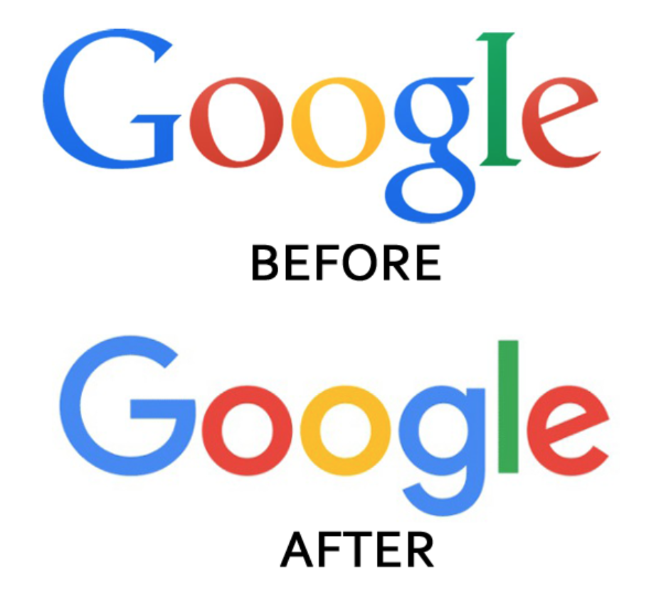
Google changed its logo this year, and most of us even failed to notice it since the change was so subtle.

Spotify went from black to green, but did you notice?

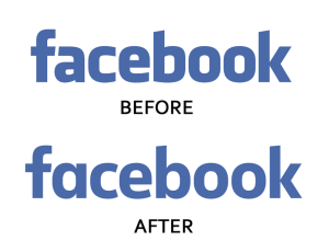
The biggest social media is gradually changing.

We liked Emerald with the gold, but the company doesn’t.

To be honest, the new one looks better.


